DCH Toyota Landing Page
DCH Toyota | Aug 2017
DCH Toyota of Simi Valley is a new and used Toyota dealership that proudly serves the areas of Camarillo and Thousand Oaks, California. I helped them create a landing page for model research pages.

DCH Toyota of Simi Valley is a new and used Toyota dealership that proudly serves the areas of Camarillo and Thousand Oaks, California. I helped them create a landing page for model research pages.

Wireframing, prototyping, UI design, art direction, Production and UI Development.
5x increase of unique sessions. Simplified update flow. Increased conversions on scheduling test drive
The DCH Toyota landing page hadn’t been updated in a while and there were a bunch of known customer pain points, which needed to be addressed. The tricky part was that there wasn’t scope for a back-end rebuild, so we had to work with what was already there and change the front end into something new.
Our goal was to improve the user experience, modernize the aesthetic and increase conversions on scheduling test drive.
The design need to be responsive since 70% of their customers are using cellphone to visit the website. Looking at the old homepage above, it’s clear that the goal was to keep it simple.
I suspect that it may have been a business or marketing requirement at the time. Because everything is so simple, however, the page is quite empty and users doesn't get engaged and leave the page. We used insights from analytics and user feedback on the old landing page to help inform the new design.
I analyzed some of DCH Toyota's competitors in the automotive industry. I uncovered the strengths and weaknesses of DCH Toyota's competitors Northridge Toyota and Toyota of Downtown. In addition, I performed a competitive analysis on Toyota of Glendale and Toyota of Hollywood which are indirect competitors of DCH Toyota’s.
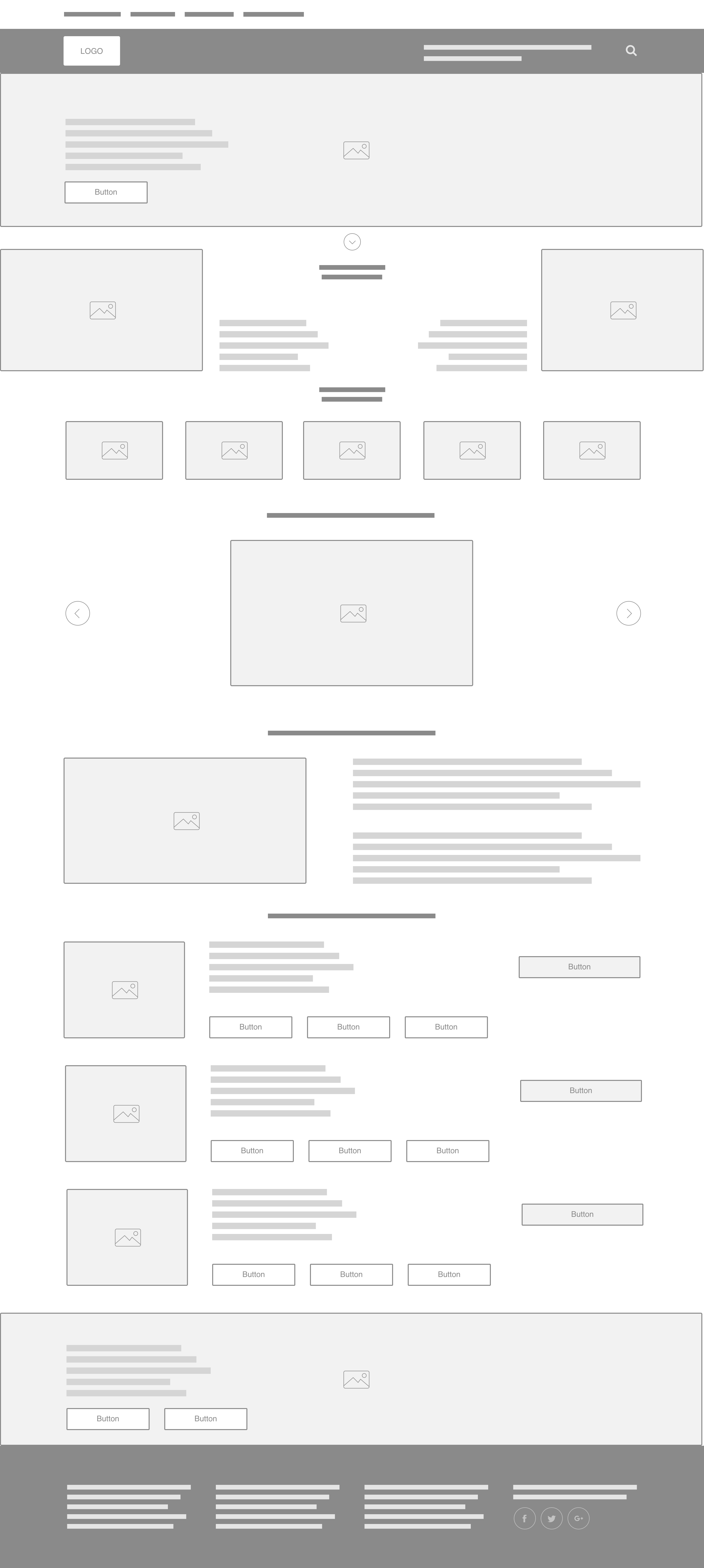
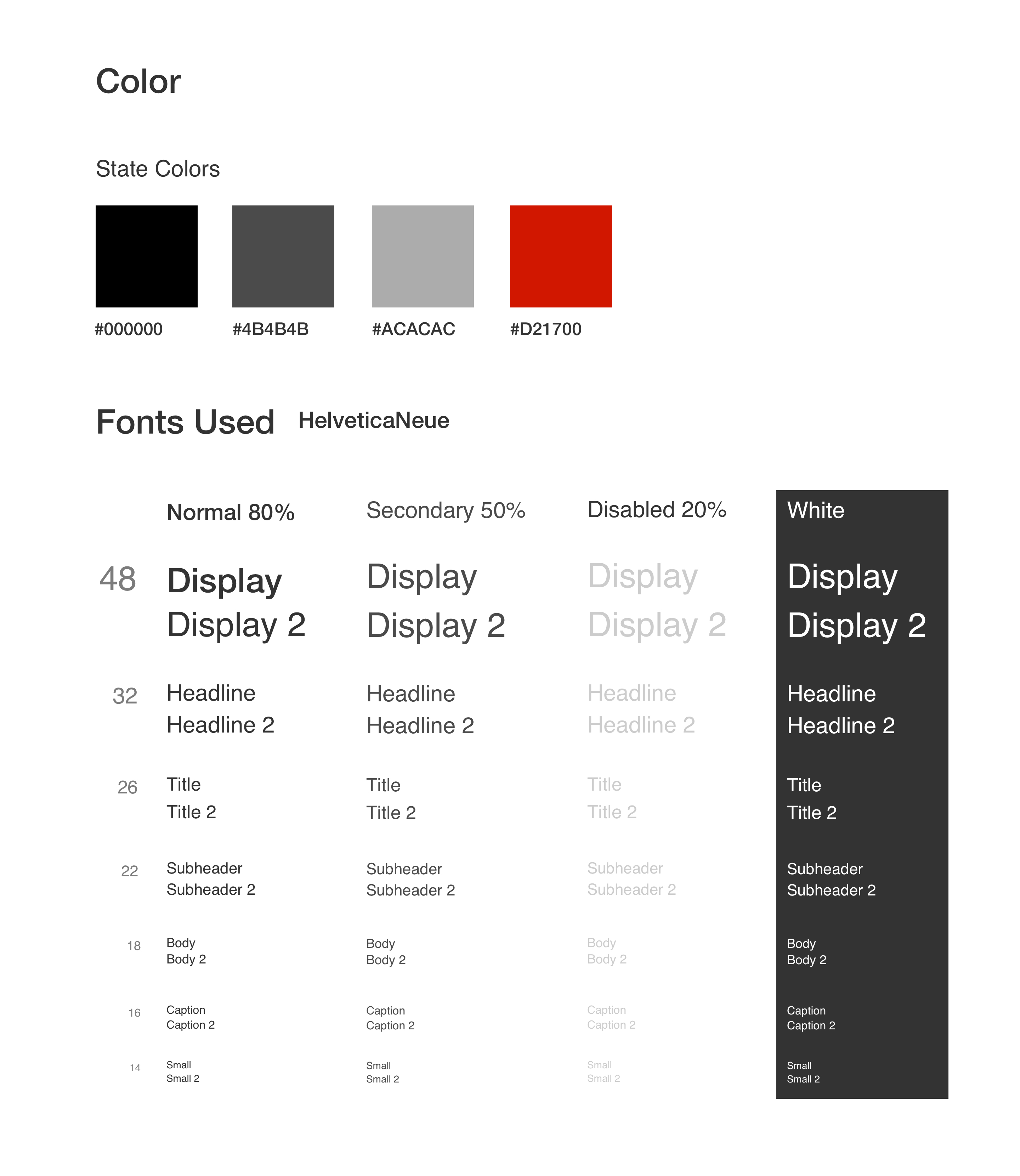
Now that we had our research and content to work with, it was time to push some pixels around. We wanted the design aesthetic to be minimal with a strong focus on content and typography. A lot of the hard work had already been done creating the wireframes. Now it was simply a matter of experimenting with colors and layout and also creating the image assets.

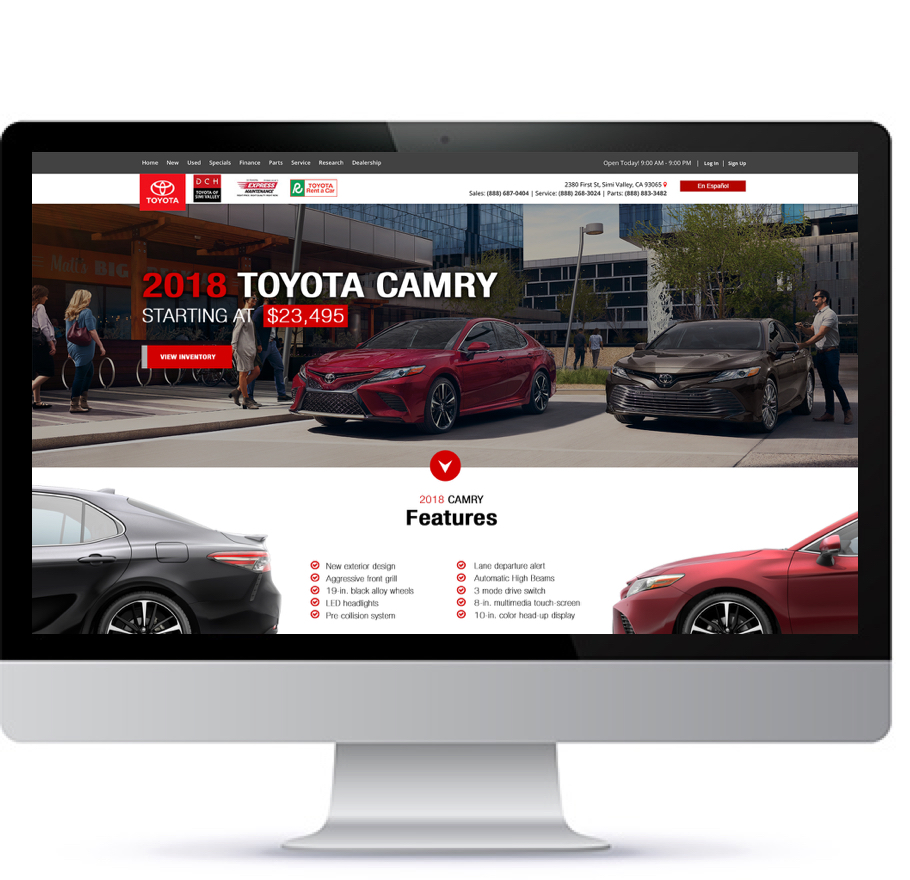
The hero banner is where user can see the car image, starting price and couple important specs of the car, so it was definitely an important part of the site for buyers and the business.
Based on analytics and talking to customers, it was clear that most people who visited the research pages want to view Inventory, so it was important that we made this as easy as possible. So we decided to have a view inventory button on heading do direct visitors to inventory page.

Once we were happy with the new design above, we A/B tested it against the old one on a small portion of our user base. Much to our delight, the new design worked wonders, performing better than the old one in key areas. While the limited technical scope did narrow our design options, it was a fun and challenging project to work on. I think it demonstrates how purely visual design changes can have a significant impact on the user experience and conversion rate of a landing page.
