Overview
My Role
User research, wireframing, prototyping, UI design. Built and maintained a design system. Art direction and brand design.
Results
Increased mobile user engagement on website with 35%. Decreased design to dev handoff time. Improved careers.yapstone.com conversion rate.
Research
Initial Kickoff
- Josh shared the past, present and future vision
- We met Mairah, a recent hire, and talked to her about her experience.
- We learned about YapCares: All 5 generations of employees want to give back to the community.
- We got a taste of the Culture by reviewing videos created by Chris
High Level Message Points
- Yapstone is “Employee-driven, company sponsored”
- Be true, be authentic, be an individual
- Teamwork makes the Dream work
- We celebrate success
- Yapstone is a stable startup
- Sophisticated but Scrappy
- Exposure to newest tech
- Career growth and mobility
- It’s more about MEANING than MATERIAL
Interview with Recruiting Team
- We interviewed Monique, Kendra, Sunaina, and Jessie.
- Big goal: launch an updated experience that the recruiting team is proud to send candidates to.
- Content Notes
- Culture
- Family Dynamic
- Inclusive
- Collaborative
- Work
- Immediate Impact
- Work you can be Proud Of
- “This is what it’s really like at Yapstone”
Designed for Browsers, not Searchers
By far the most common usage pattern is for a candidate is to first find an interesting job listing on a third party site and link directly to the job listing for application.
The users who are coming to the career site on their own, are interested in the company and the offering first.
Since so many candidates interact initially with the job description, the job description itself should be considered a competitive asset.
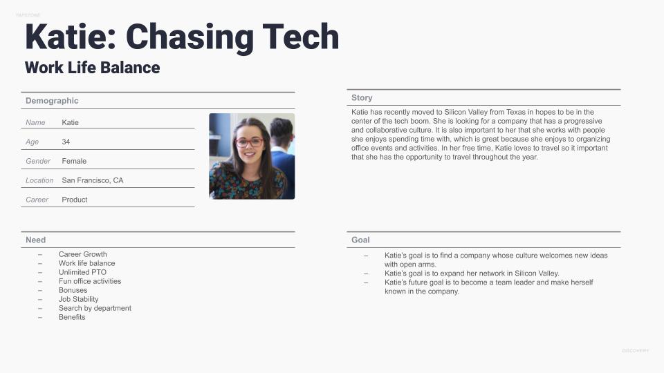
Persona Creation
Next, I used all of the qualitative data i gathered during the research process to create Katie, my user persona. Katie has recently moved to Silicon Valley from Texas in hopes to be in the center of the tech boom. She is looking for a company that has a progressive and collaborative culture. It is also important to her that she works with people she enjoys spending time with, which is great because she enjoys to organizing office events and activities. In her free time, Katie loves to travel so it important that she has the opportunity to travel throughout the year.
Competitive Analysis
Candidates are Mobile First
Mobile browsing has surpassed desktop in the market. Candidates are increasingly applying for positions from their phones, and we expect that trend to continue. In addition, Google’s search algorithms give priority to mobile first sites.
Design Notes
- Layout should be optimized for mobile presentation
- It should be optimized for speed
- Minimize form interactions (drop downs etc)
Career Sites have similar structures
Content Strategy
The Careers Site Story
Headline and Video: The first opportunity to deliver a Brand Message, in order to pique the candidates interest.
Mission: The Mission makes the candidate excited to work at Yapstone. It offers a succinct vision of the purpose of the company and answers the question: Why you should be excited to work at Yapstone.
Culture: What would it be like to work at Yapstone?
Jobs: Is there an opportunity for me? (main Call To Action)
Design
Designing the blueprint
After gaining buy in from the client and the internal team we went to work flushing out a set of responsive wireframes that would define all the features on each page. With the Persons, Use Cases, Goals and Flow Diagrams in hand we had a solid foundation to design a UX that the client’s audience would grow to love. In total the team put together over 20 annotate wireframes. Each design highlighting the features and functionality on each page and how a user would flow through the site gaining valuable information and making an informed purchase decision.
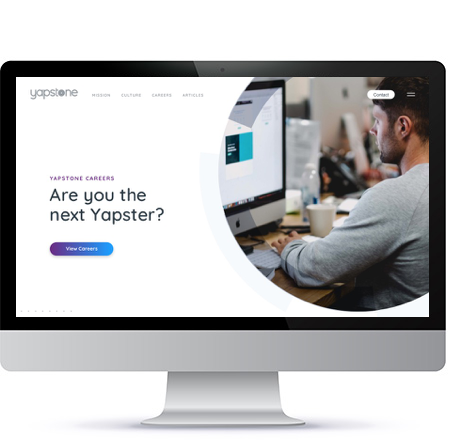
High Fidelity Mock Ups
With a solid set of wireframes, the company’s style guide and an approved style scape direction the high fidelity phase of the process still took a ton of time. The team and I slaved over the details and worked late a few nights to present two completely different directions for the visual UI. The approved direction spoke to the clean airy feel of the brand which was simple yet complex at the same time. It design wasn’t loud or in your face it was easy on the eye and told a story as a user scrolled down the page.
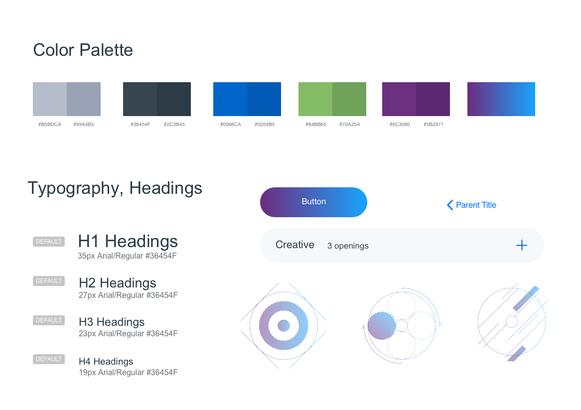
Site Style Guide
Defining a Design System
The final step in the design process was to hand everything off to the development team. We put together a quick design system the defined all of the grids, colors, fonts, buttons, icons, and UI elements used throughout the site design. This helped the development team to quickly move through their process and launch the site.