Overview
My role
User research, prototyping, UI design and art direction
Results
Increased unique visitors by 30% and exceeded expectation by raised approximately 8% revenues every month.
Research
Pain Points
- Lack of information/details: Only the happy paths are fleshed out, not all all languages are covered, payloads cannot be test, and there is no versioning.
- Demonstrate value: There are no test API keys, so it takes a long time to demonstrate value to the client.
- Lack of clarity: Inconstancy between documentation and code, documentation is understood internally but is poorly communicated to clients. Most of the time clients reach out to Yapsters for clarity rather than reading through documentation.
- Lightweight process for reporting issues: Zendesk, emails, JIRA tickets, Customer Service reports, and Slack channel with engineers for large clients.
- Process for updating the API documentation is slow and inefficient.
Mission of the new Developer Portal
To turn the Yapstone API into an asset that generates new prospects organically, helps close deals with potential customers, and supports a high level of customer satisfaction among existing customers.
Goals
- We want developers to Look at YapStone’s capabilities and get excited about working with us
- Finish their integration work quickly since we only get paid once they are processing transactions
- Recommend YapStone to others and bring YapStone with them to their next company
- Have fun!
Everything we build should be done with an eye toward making the developer experience as enjoyable and quick as possible. External developers have a lot of work to do, only some of which relates to YapStone. They want to get done quickly so they can move on to the next thing.
External developers do not want to become experts in payments, onboarding, underwriting, etc. They likely won't care about jargon or details beyond how to integrate so they can get money flowing through their systems. We shouldn't even assume developers know that most of the payments rails are batched, nor should we attempt to educate them. We have payment APIs and instructions on how to use them and documentation on when funds will be available. Everything else is needless detail.
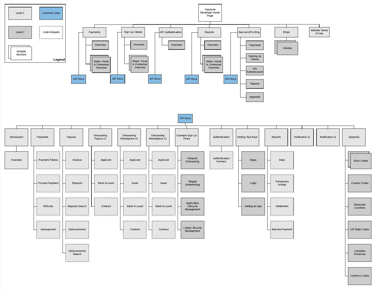
Information Architecture
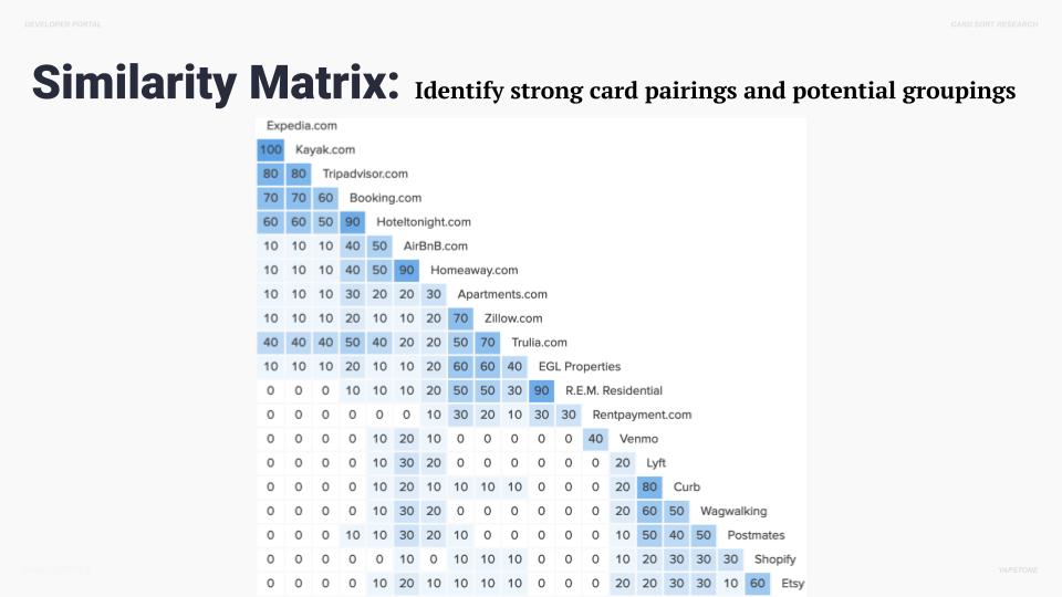
Card Sorting
I created a high-level list of site features to further define and guide the vision for the product. Prioritizing the features with supporting research created a clear order of execution.
Next, I conducted an open card sort to get a sense of how users think of groups, concepts and categories. Because we are exploring several categorization concepts we want to learn what is most natural to people.
Sitemap
Once we understood the users need and developed the Use Cases, we went to work on the information architecture. Developing a high level site map and specific user flows, we then guided the client through the complete experience, strategize on site content and discussed next steps.
Best Practices
- Topic-based authoring
- Clear explanation of every call and parameter
- Details - what each call in our API does, and each parameter and all their possible values, (including their type, formatting, rules, and whether or not they are required)
- Examples - How each call is made, explanation of the requests, and sample responses
- Sample code - “Analysis of eye-tracking records showed that visual elements, like example code, caught the attention of developers who were scanning the page, rather than reading it line by line.”
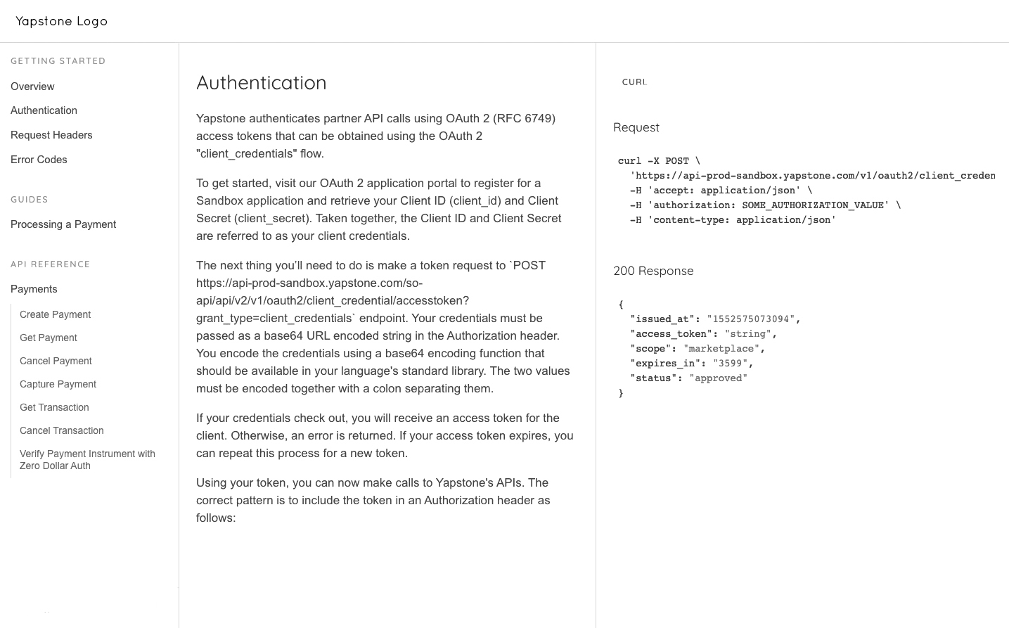
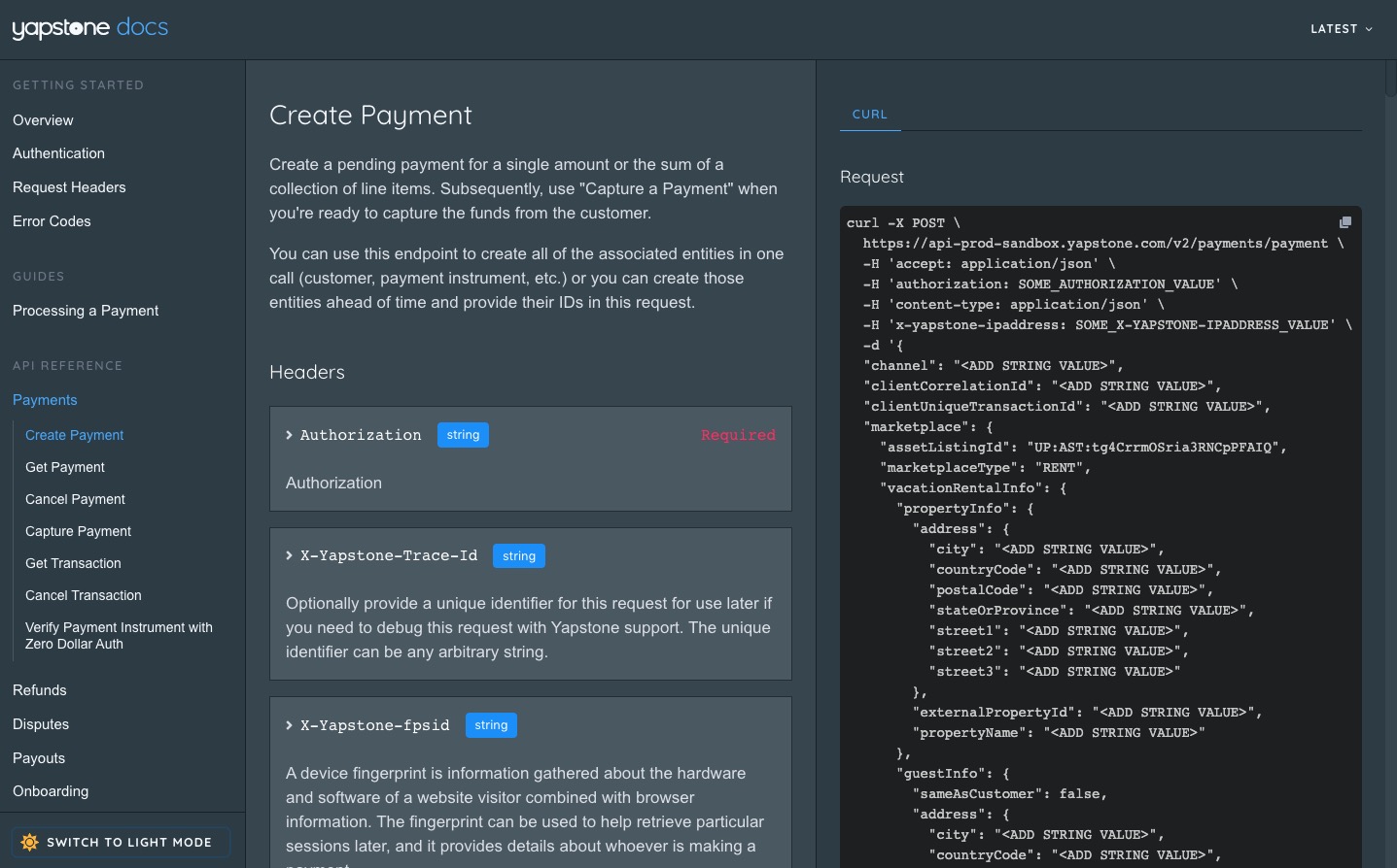
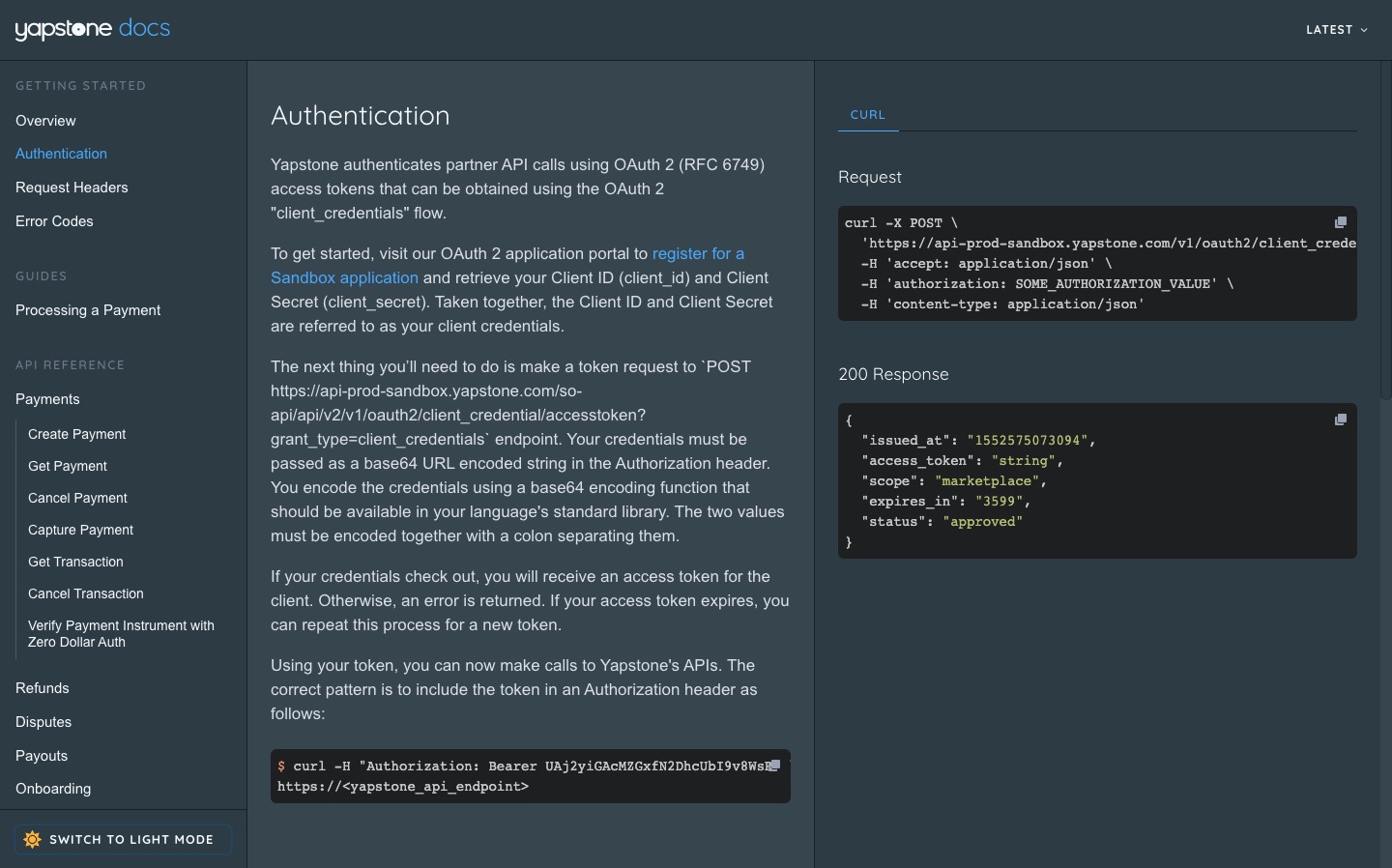
UI Design Strategy
- General Page Layout
- Overview
- Visuals
- Code Snippets (source, Github, CodeSandbox, etc.)
- Link to API reference
- Connecting product/feature overviews with API references
- Table of Content for on each subpage
- Maintaining version documentation
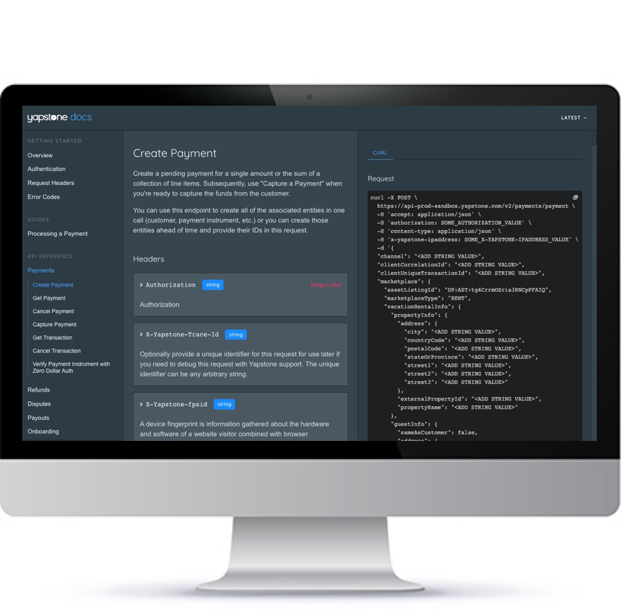
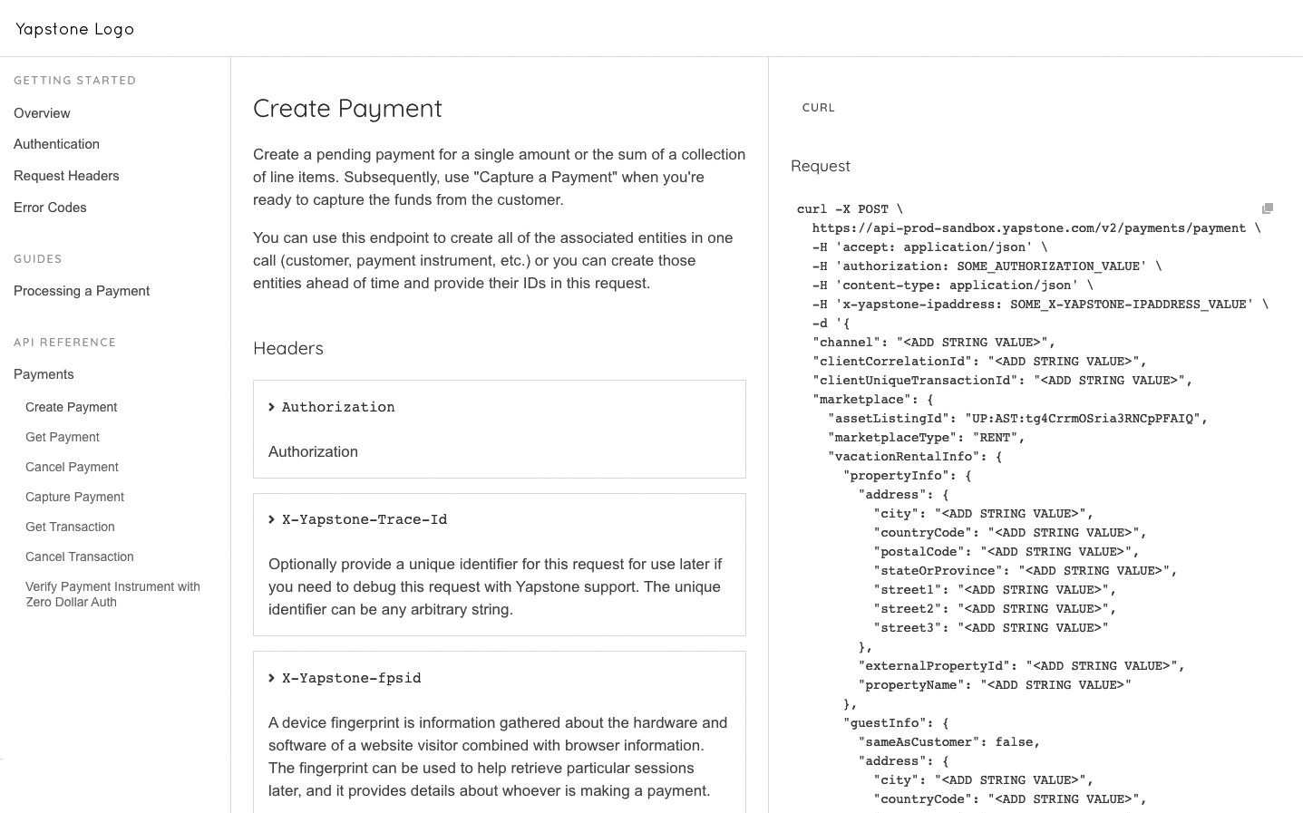
Design
Mid Fidelity Wireframes
After gaining buy in from the client and the internal team we went to work flushing out a set of responsive wireframes that would define all the features on each page. With the Persons, Use Cases, Goals and Flow Diagrams in hand we had a solid foundation to design a UX that the client’s audience would grow to love. In total the team put together over 50 annotate wireframes. Each design highlighting the features and functionality on each page and how a user would flow through the site gaining valuable information and making an informed purchase decision.
High Fidelity Prototypess
With a solid set of wireframes, the company’s style guide and an approved style scape direction the high fidelity phase of the process still took a ton of time. The team and I slaved over the details and worked late a few nights to present two completely different directions for the visual UI. The approved direction spoke to the clean airy feel of the brand which was simple yet complex at the same time. It design wasn’t loud or in your face it was easy on the eye and told a story as a user scrolled down the page.
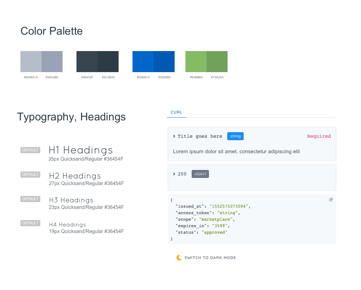
Site Style Guide
Defining a Design System
The final step in the design process was to hand everything off to the development team. We put together a quick design system the defined all of the grids, colors, fonts, buttons, icons, and UI elements used throughout the site design. This helped the development team to quickly move through their process and launch the site.