Overview
My Role
User research, wireframing, prototyping, UI design. Built and maintained a design system. Art direction and brand design.
Results
A usable and aesthetically appealing online platform with strong brand identity that seamlessly manage disputes and chargbacks by creating and submitting rebuttal letter to payment processor.
Research
Internal Pain points
- Inefficient Communication: Customer Service and Chargeback agents spend too much time educating and repeating themselves with each merchant.
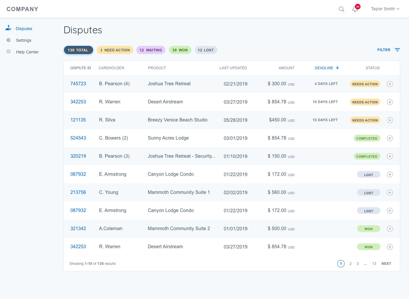
- Limited visibility of Chargebacks: Chargeback specialists don’t have a way to look at chargebacks (and related chargebacks) from a birds eye view. Zendesk is too granular.
- Cumbersome Process: Managing and guiding merchants through the end to end chargeback process is a manual process done across multiple platforms.
- Not Scalable: An improved CB process will reduce the need for hand-holding customers and ultimately increase the efficiency and output chargeback agents.
Customer Pain points
- Uninformed: Are unaware of what CBs are, how the process works and why it’s happening to them.
- Inefficient Communication: Really frustrating when communication from Yapstone is sporadic, fragmented and often delayed. Issue not resolved even after multiple calls and emails back and forth. Having to discuss things one CB at a time.
- Limited Transparency: Need to have visibility into the CB process/status to be informed throughout the CB process.
- Lack of Visibility of Funds: Customers want to know where their money is and when they might get it back.
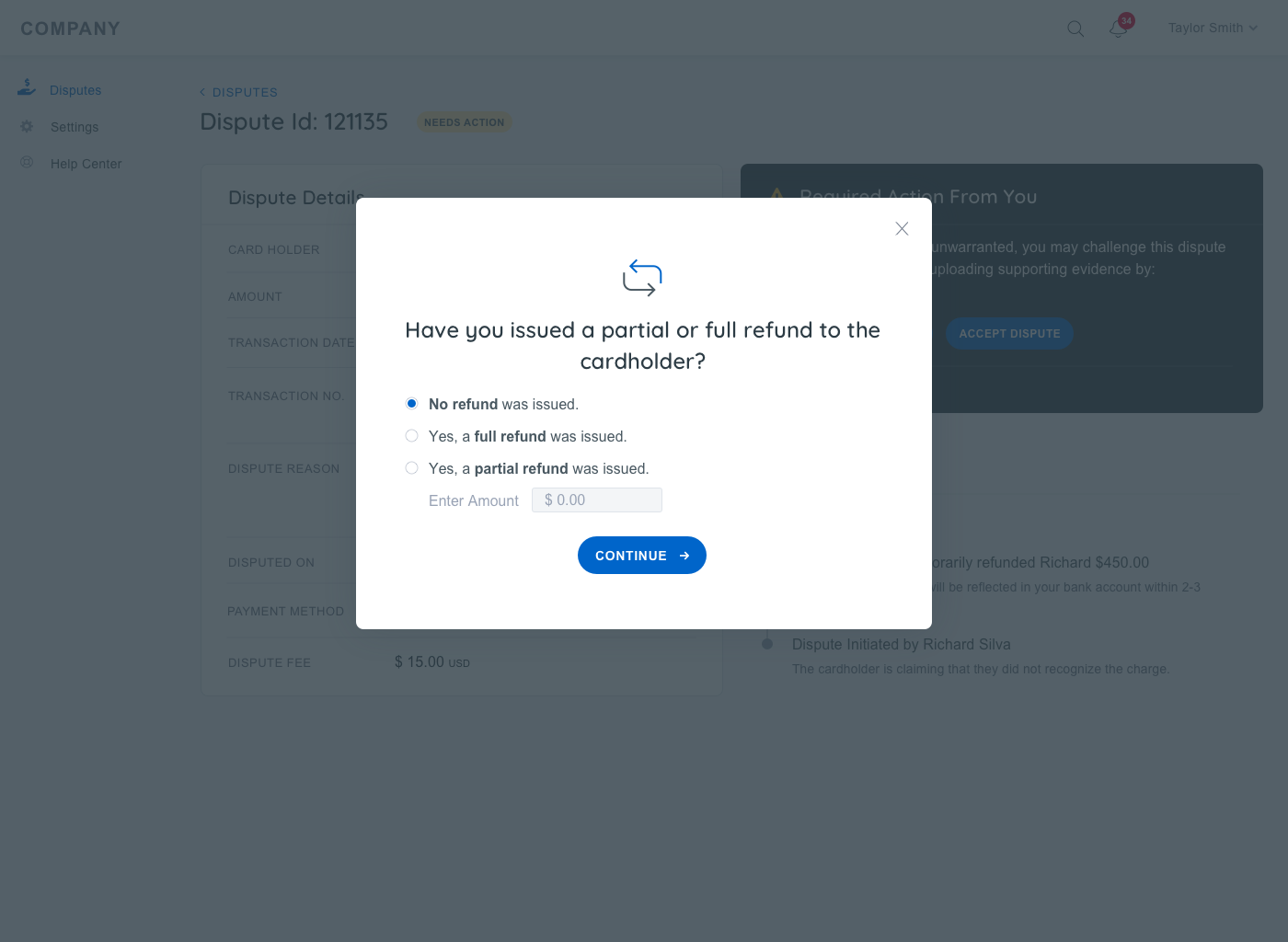
Focus on the customer self-service
- Help them Learn
- What disputes are, what the process is like, and specific reason codes
- Best practices of how to prevent disputes in the future
- Empower them to Act
- Take any actions related to new disputes
- Provide documentation
- Equip them to Monitor
- Check status of dispute at anytime
- Get notified when something happens in the system
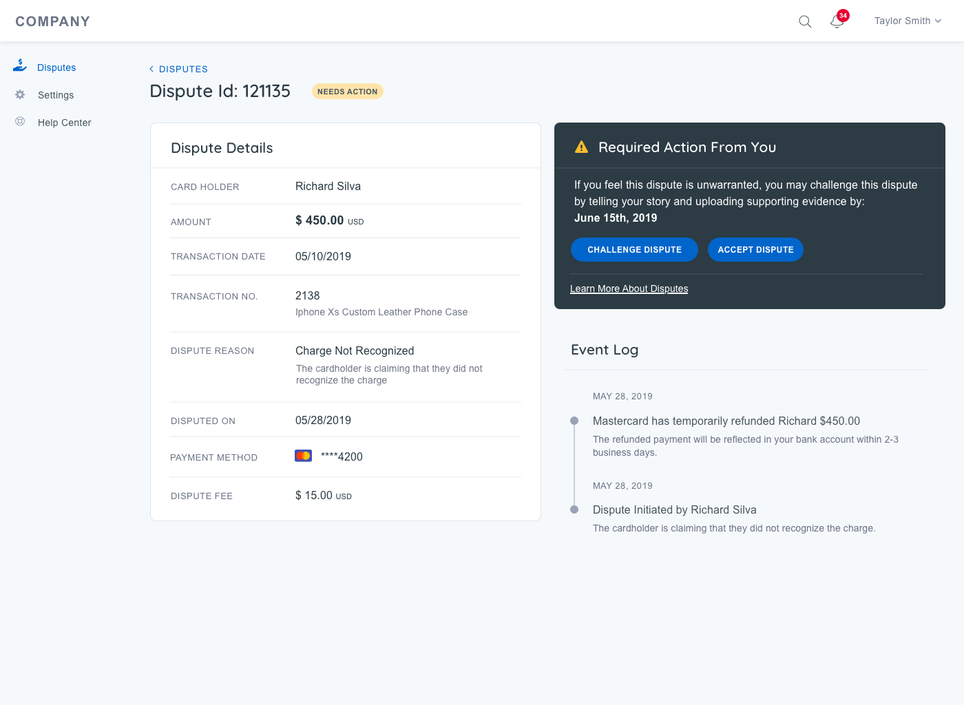
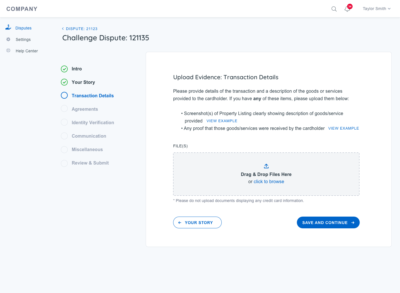
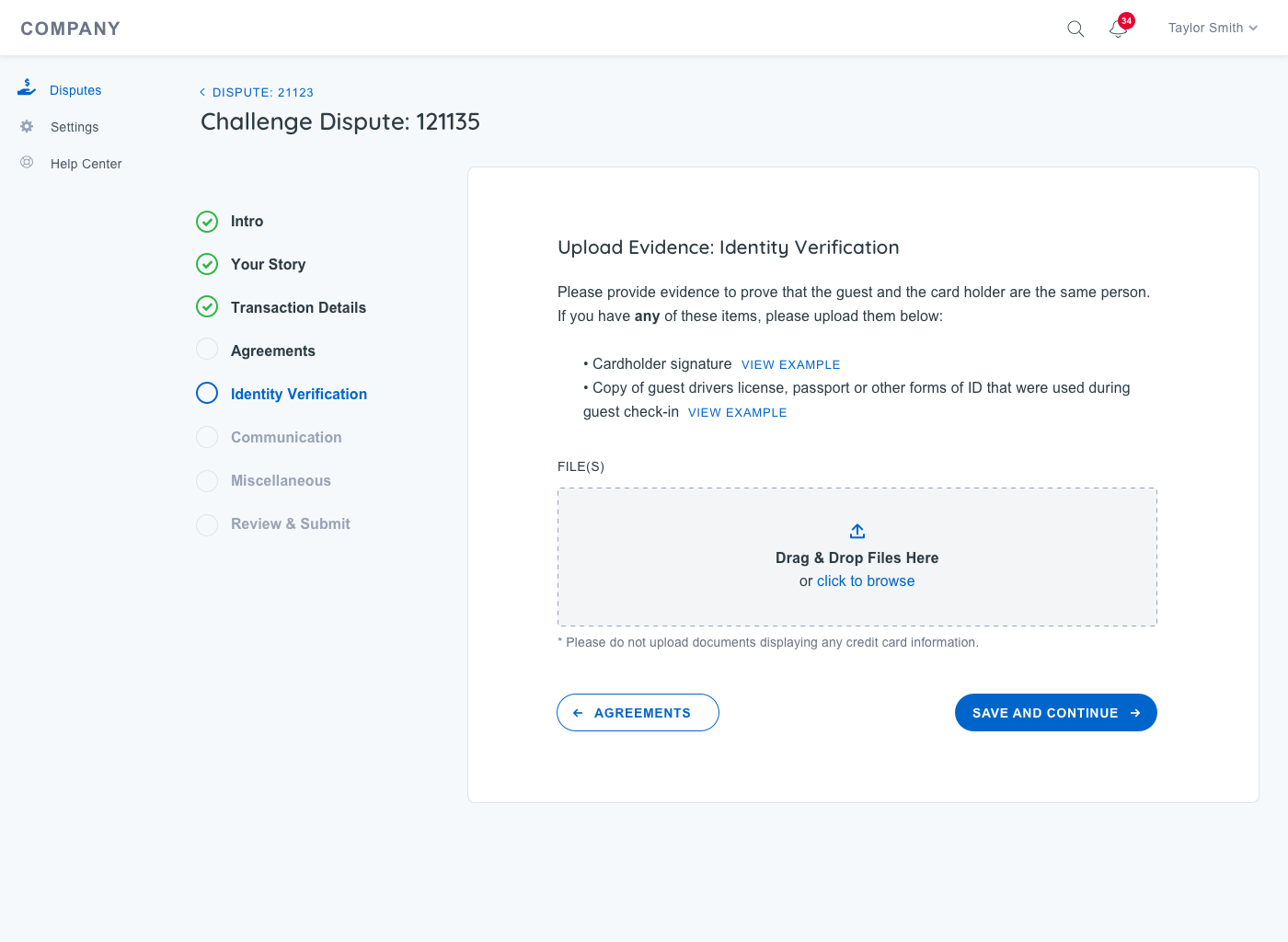
Dispute Center Pilot
Hypothesis: will merchants gather the right, high-quality evidence, on their own, and create a brief that is likely to win their dispute case.
- Worked the Risk team to research and design this product
- Tested with merchants in the wild
- Currently independent of Transact APIs, and works with legacy system
- Launching with real customer in July
Information Architecture
Sitemap
Once we understood the users need and developed the Use Cases, we went to work on the information architecture. Developing a high level site map and specific user flows, we then guided the client through the complete experience, strategize on site content and discussed next steps.
User Flow
Apart from the ease of use, the simplicity of disputr center wizard was crucial. Analyzing the funnel of , we were able to identify their biggest pain points and streamline the flow for the least amount of steps and highest completion ratio.
Design
UI Process
As a design team we reviewed all the major competitors in payment industry. This include popular companies such as Stripe, Braintree and Paypal. We wanted to deeply understand how these brands spoke to their customers online and guided them through the dispute experience.
As the visual team and I got started on the look and feel for the site that Yapstone provided us with the companies updated brand book and style guide. All of the colors, fonts, icons and photo style were laid out. It was our job to translate these new visual brand into a digital experience.
We started off by creating quick iterative style scape design documents. These helped define a design direction. They also provided the client insight into how the nav bar, buttons, backgrounds and UI elements would look before we presented a Big Bang design mockup.
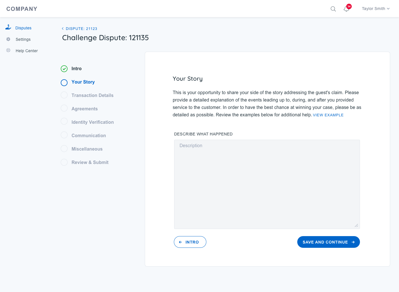
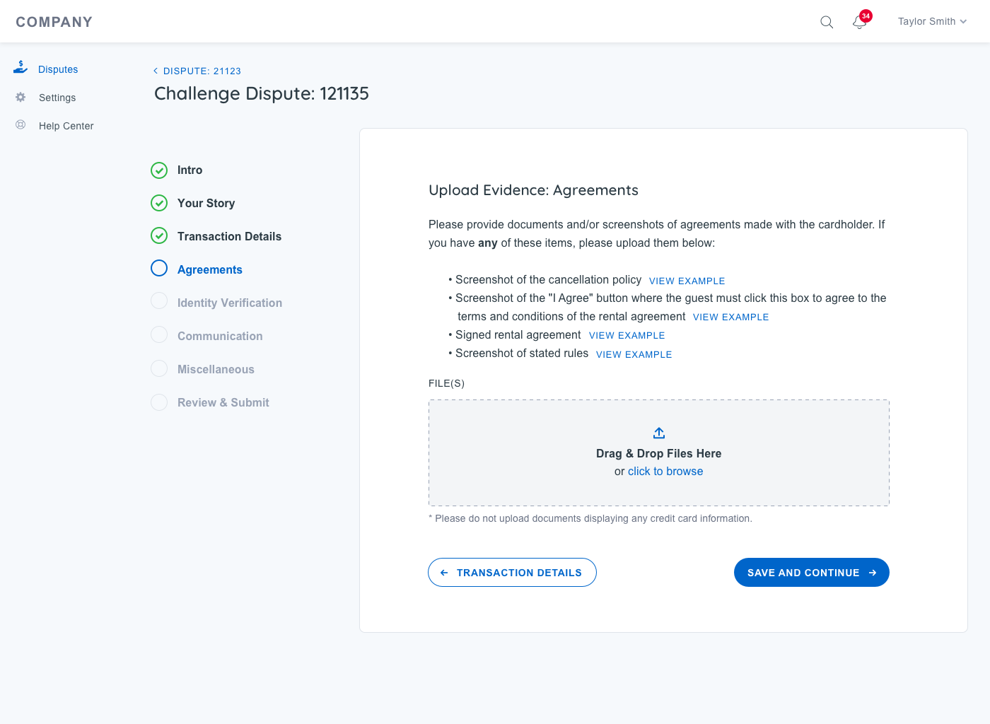
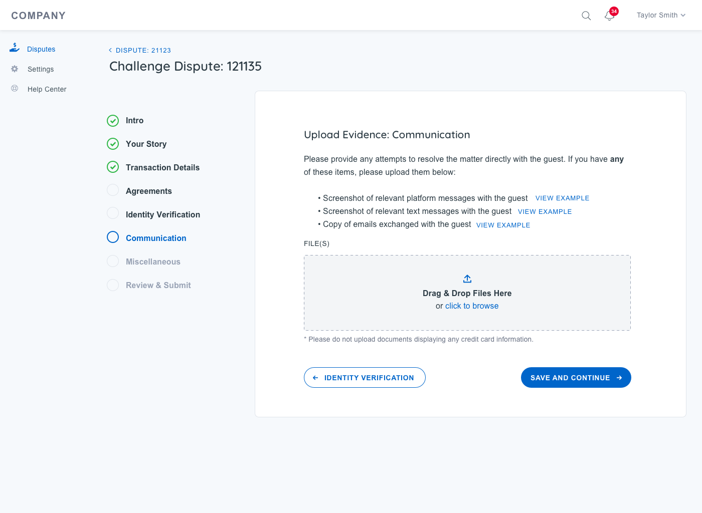
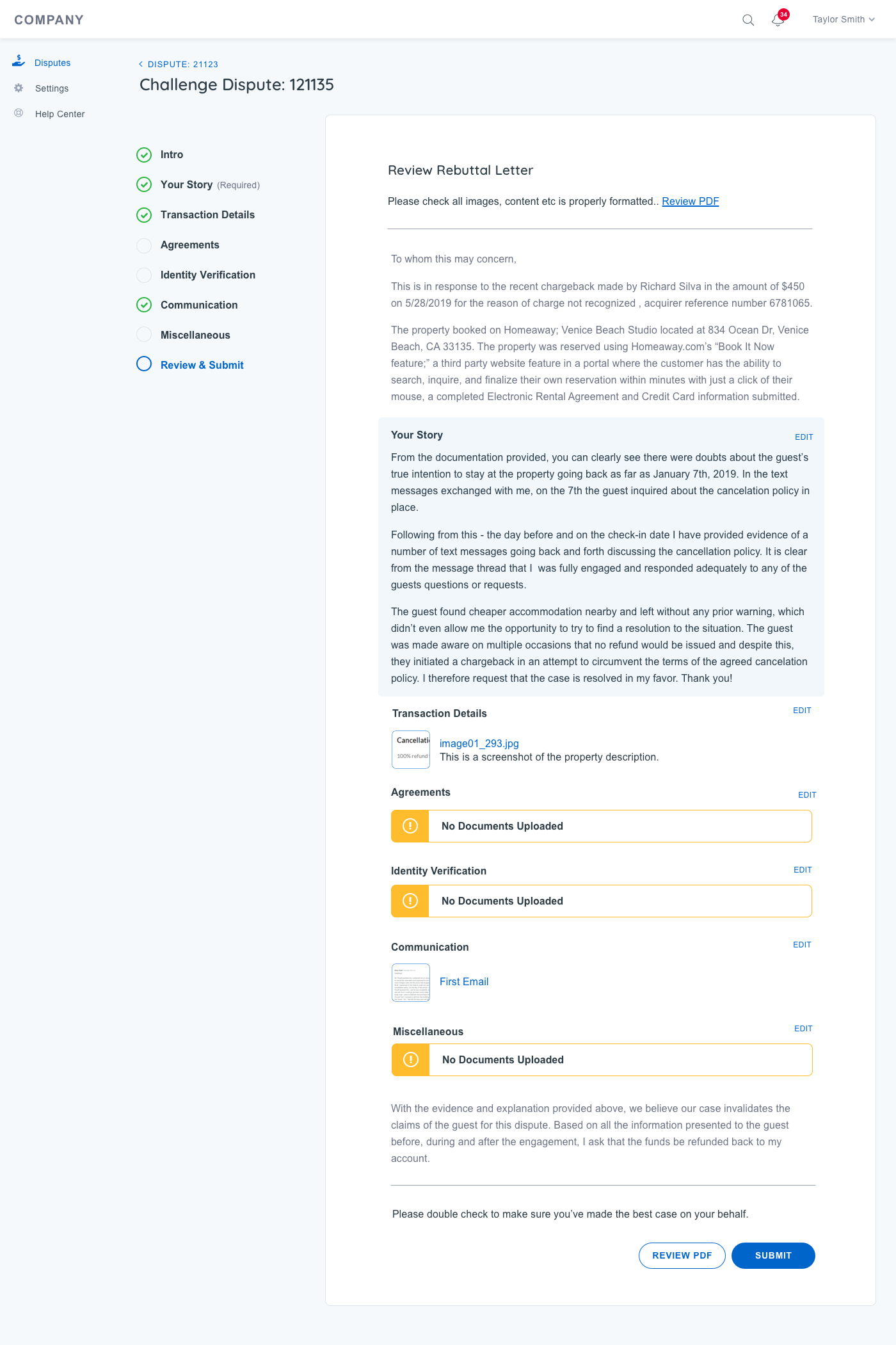
High Fidelity Prototyping
After gaining buy in from the client and the internal team we went to work flushing out a set of responsive wireframes that would define all the features on each page. With the Persons, Use Cases, Goals and Flow Diagrams in hand we had a solid foundation to design a UX that the client’s audience would grow to love. In total the team put together over 50 annotate wireframes. Each design highlighting the features and functionality on each page and how a user would flow through the site gaining valuable information and making an informed purchase decision.
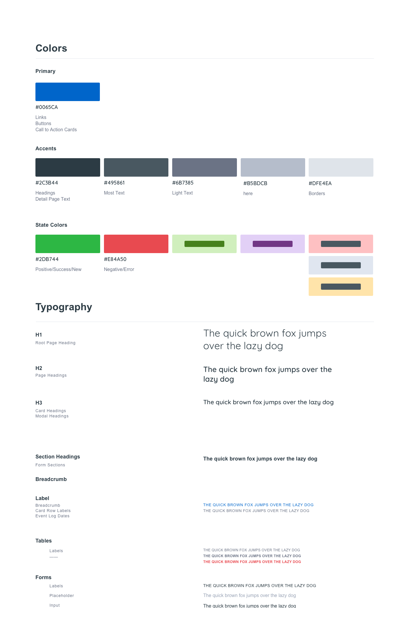
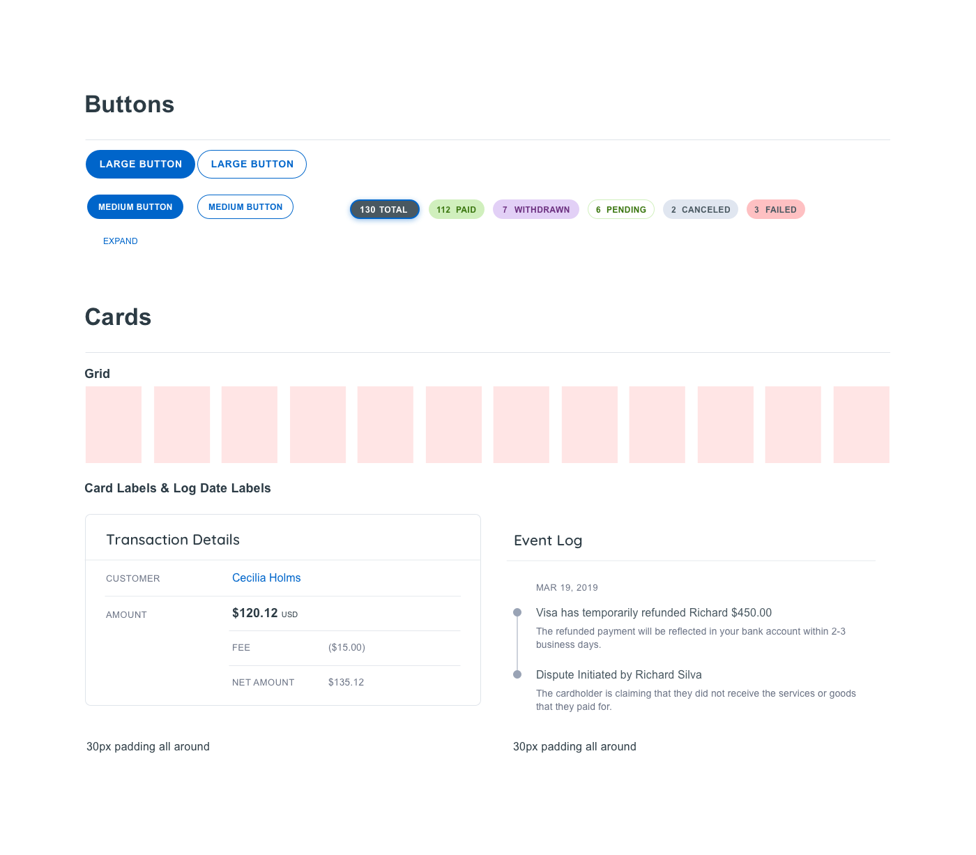
Site Style Guide
Defining a Design System
The final step in the design process was to hand everything off to the development team. We put together a quick design system the defined all of the grids, colors, fonts, buttons, icons, and UI elements used throughout the site design. This helped the development team to quickly move through their process and launch the site.